Improving UX of a digital health platform
As a digital product consultancy, bene : studio has always been interested in examining systems and applications and finding ways to improve them.
The team at bene : studio is not only curious about improving systems and applications but loves sharing knowledge and therefore has made the findings of some of the product audits public to support the HealthTech community, as the studio becomes more and more involved within this industry.
In this article you will read the outcomes of a Product audit we’ve delivered for Lasa Health. Product audit is a core service of bene : studio. It serves as a foundation to support the product planning, design, and development services for a client.
About Lasa Health
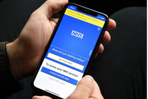
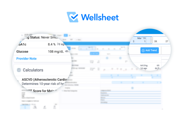
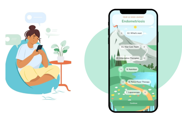
Lasa Health provides a digital health platform for patients with chronic conditions. It educates individuals about their condition, how to manage symptoms, and explore treatment options. The company was founded in 2021 and is based in Lubbock, Texas.
Bene : studio delivered a product audit to Lasa Health, reviewing their UX design.
About this product audit focusing on UX
This audit (also known as Expert review or Design review) summarizes our impressions while checking your product. It enlists and weighs the issues found, and provides suggestions to solve them.
We love design, research and discovery, and believe that the experience-based suggestions we collected help you reach your business goals
This is not a complete product audit but hopefully gives you a hint of what value an audit can provide.
What you will learn
First, you can read about what is a product audit and what principles (“heuristics”) we consider during the process.
Second, we took a deeper look at the onboarding flow and the participating screens – you can read our findings and suggestions.
Third, we measured and categorized the issues by severity and the estimated resource needed for a solution.
Finally, we recommend steps to take to increase the user-friendliness of your product.
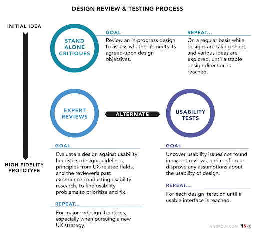
What is a product audit?
It is important to learn the key characteristics of a product audit:
- It is complementary to (and not interchangeable with) a usability test
- It doesn’t consider analytics
- It can inspect various specifications of a user flow or an isolated segment of the design
- The reviewer might not be a member of the target audience
- As opposed to user testing, it can better articulate how well the application meets existing design/UX standards, best practices, and common principles
The figure below shows the role of the product audit within the design and testing process of a product:

The heuristics we use
Here are the main heuristics that we consider in the course of our reviews:
- Affordance – how clearly interface elements suggest how they should be used
- Consistency – internal (consistent usage of the interface throughout the app/website/brand) and external (consistency with industrial patterns / best practices / commonly used symbols and standards)
- Tolerance – preventing errors, helping recognition of and recovery from errors
- Accessibility – usability by all intended users
- Visibility of system status – user knows where they are, what they can do, how they can more forward, getting feedback upon events
- Match between the system and the real world – speak the user’s language, choose familiar expressions and visual elements that follow real-world conventions in the topic domain
- Simplicity & clarity – Keep the content and visual design of UI focus on the essentials. UI is clear and easy to understand.
- User control and freedom – empowering the user to freely interact with the system and provide ways back from states
- Recognition over recall – preventing users from having to guess or remember info (that can otherwise be displayed) to proceed
- Flexibility and ease of use – tailoring the system to various user groups (or experience levels) without causing cognitive burden cross-group
- Purposeful design – Making sure that UI elements are visually designed to support their function, and visual hierarchy supports users goals.
Flow analysis of the onboarding in the Lasa Health app
What you can find here: what works great and what needs improvement
In this section, we go through the onboarding flow and examine its screens, interactions, and UX, and assess how well they fulfill the heuristics mentioned in the previous section. We will highlight design decisions that are well-made and should be kept in the long run.
We will also highlight some issues that should be addressed. We also include suggestions to remedy them.
For the assessment, we used an iPhone device. Some issues might occur differently onther platforms
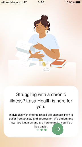
First launch


Already great:
- Consistency: The illustration supports the friendly atmosphere that Lasa Health wishes to create for its users.
To improve:
- Consistency The name Amie Health changed to Lasa Health, thus it should be reflected in the logo on the splash screen.
- Suggestion: Update the name under the logo.
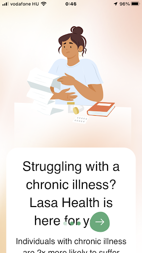
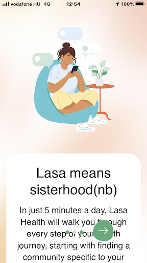
Intro slider


Already great:
- Consistency: The illustration, colors and round shapes support the friendly and helpful atmosphere that Lasa Health wishes to create for its users.
- Accessibility: It is a plus that I can adjust text size (even if I only can do it through the OS settings).
To improve:
- Consistency: The text suggests that Lasa Health assists users having various kinds of chronic illness, but – as we learnt – Lasa Health now focuses only on endometriosis.
- Suggestion: Rephrase the text to reflect this goal.
- Flexibility and ease of use: Even when choosing a normal text size, the user has to scroll much to read the message.
- Suggestion: Make more room for the text by shrinking the image.


To improve:
- Flexibility and ease of use: Overlay pagination controls make the text (and the slider status) difficult to read.
- Suggestion: Create a non-transparent background for the controls so it doesn’t overlap with the text. The bottom of the scrollable text area should be above the controls. To make more room for the text, consider moving the controls closer to the bottom of the screen (this needs a little testing to ensure the user still can use the controls comfortably) and shrinking the image in the top.


To improve:
- Affordance, Visibility of system status, User control and freedom: Looks like I cannot step back to a previous slide. In reality, I can, either by swiping with my finger or tapping on one of the tiny dots at the bottom to do this. Still, none of these options have a visual representation, potentially causing a “stuck” experience to a less experienced phone user.
- Suggestion: Starting from the 2nd slide, place a “back” button to the left of the slider state dots.
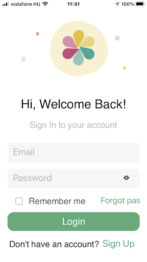
Login screen

To improve:
- Visibility of system status: Could it happen that we saw the ”Welcome Back” message right on our first visit?
Suggestion: Please check it and if so, make sure to display this just for returning users. - Flexibility and ease of use, Consistency: If, from this screen, I close the app and re-enter, I am taken through the intro sliders again. It is OK if I haven’t signed up yet, but what if I did but logged out?
- Suggestion: If the app remembers my first visit (as the “welcome back” message suggests it does), it could already drop me to the login screen when I reopen the app.
- Flexibility and ease of use, Accessibility: “Forgot password” link doesn’t display correctly, even when I choose a normal font size.
- Suggestion: Manage different font sizes in the app. Either create a layout that accepts any font sizes I set in the OS settings (which is quite difficult) or restrict choosable font sizes. For the latter, the app shouldn’t inherit the text size set in the OS settings, but instead offers some text size options in the app. As a third option, the app can be redesigned with a single text size option which is acceptable for many user groups. (NB: This doesn’t substitute accessibility for e.g. visually impaired users)
- User control and freedom: The “eye” button (display password) has a very small touchable area for the human finger, making it difficult to activate. To make it worse, the area around the eye button (i.e. the password input field) is a touchable area itself, too, with different functionality (make the keyboard disappear). The result is almost always that I want to display my password, but the keyboard disappears instead.
- Suggestion: Increase the touchable area for the “display password” button.
- Suggestion 2: Check all the other buttons in the app to ensure they have enough touchable areas.
Forgot password screen

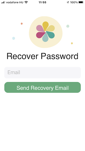
To improve:
- Affordance, Visibility of system status, User control and freedom: There seems to be no way back from the Forgot password screen.
- Suggestion: Create a “back” button.
Sign up screen
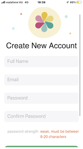

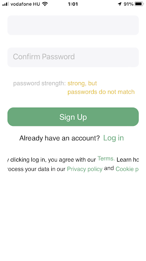

To improve:
- Visibility of system status: Password strength is checked right upon loading the page, before I type anything in the password field. Similarly, the password mismatch check is triggered before I even start writing into the “Confirm Password” field.
- Suggestion: Only start checking password strength when I start typing it. Also, only check password match when I have characters entered in the “Confirm password” field.
- Visibility of system status, Tolerance: App doesn’t reveal all password criteria in advance.
- Suggestion: It’s not critical, as the user learns it from the feedback, but they have to fail the check to learn it. You can prevent it by placing a little line below the Password field with the criteria.
- Visibility of system status, Tolerance: Password strength check is not right below the password field. Might need scrolling to get feedback.
- Suggestion: Also not critical as the validation message is still quite close to the Password field and in a topic-relevant place (under Confirm Password). Yet it would be correct to display the validation where it belongs: password syntax errors below the password field, password mismatch errors below the confirm password field.
- Simplicity & clarity: There is a big scrollable empty area below the page content.
- Suggestion: Remove it.
- Visibility of system status, Tolerance: At times, there is no validation message coming from the backend after hitting “Sign up”. E.g. e-mail is already used or not filled in. Users can be frustrated not knowing what prevents them from signing up.
- Suggestion: Give feedback to the user in all cases.
- Flexibility and ease of use, Accessibility: The last paragraph doesn’t display properly, even when I choose a normal font size.
- Suggestion: Make sure the textbox only fills in the visible area (incl paddings), and also that the text inside doesn’t overflow the box, but wraps properly.
Agree to terms

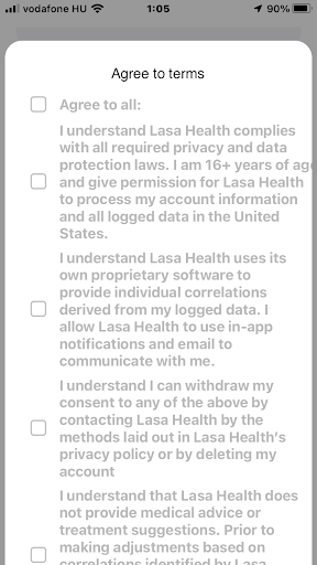

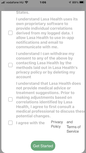
To improve:
- Simplicity & clarity: Text has a low contrast with the background. It is uncomfortable to read so much text, especially if the font size is set to small.
- Suggestion: Make the text darker.
- Consistency, User control and freedom: Privacy Policy and Terms of Service links are using a different font than the rest of the paragraph for no clear reason. Also, the links didn’t work. (maybe because it fails to open another popup from a popup?)
- Suggestion: Align the font types and fix the links.
- Flexibility and ease of use: Some text overflows the popup.
- Suggestion: Make sure the textbox only fills in the visible area (incl paddings), and also that the text inside doesn’t overflow the box, but wraps properly.
- Visibility of system status, Tolerance: “Get Started” button is always active, but if I don’t check all the checkboxes there is no error message coming back. Only the button doesn’t work.
- Suggestion: Either disable the “Get Started” button until I check everything – but that wouldn’t give a validation message, plus not consistent with the Sign up button -, or give a backend error message after pressing that I should check everything to proceed.
“Hi” screen
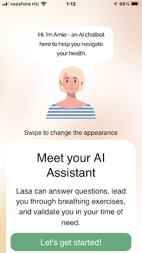

Already great:
- Match between the system and the real world: Button label is motivating and fits the narrative.
To improve:
- Consistency: Amie has since become Lasa, but it is not updated everywhere.
- Suggestion: Replace all occurrences of Amie with Lasa.
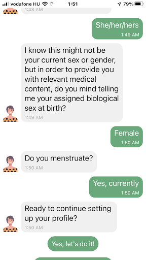
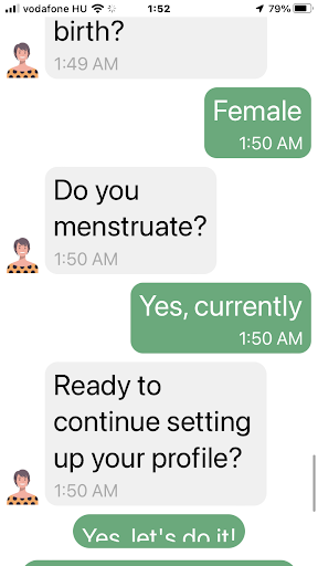
Onboarding chat
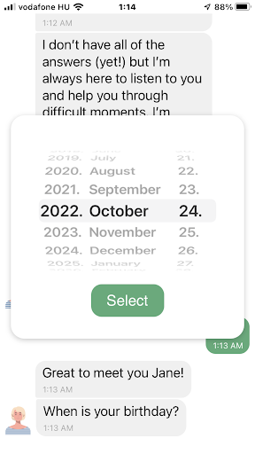

To improve:
- Visibility of system status: Lasa’s messages come too quick. It doesn’t reflect the speed a normal person would type at, and it doesn’t allow enough time to read the messages one by one. It wouldn’t be a problem, but a new message always pushes the previous message up without transition or animation, making the user lose focus on the message they’re reading.
- Suggestion: Do one or more of the following: 1. Compress Lasa’s messages in fewer bubbles. 2. Animate the arrival of a new message and its shifting previous messages. 3. Add more delay between Lasa’s messages – about as much as they need to be read. You can get a lot of inspiration from other chatbot software.
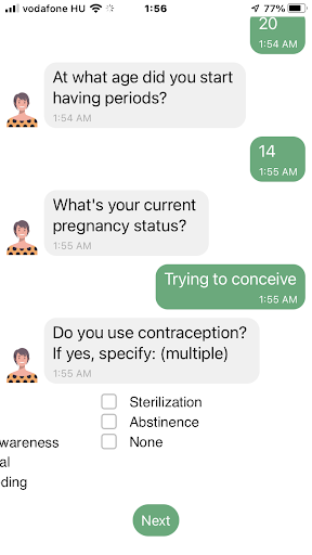
- Flexibility and ease of use, Match between the system and the real world: For the question “When is your birthday?”, there is no button that opens the date picker, it appears immediately. This causes confusion because 1. User doesn’t have time to read the question before the popup get their attention; 2. When the user looks for the question, they find it below the answer (date picker), contradicting the conventional order.
- Suggestion: Add a button like “Select an option” below the question which opens the date picker popup.
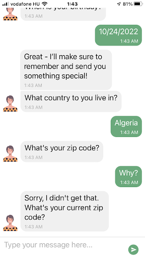

To improve:
- Visibility of system status, Consistency: Lasa doesn’t share why she needs my zip code, though it might be a sensitive data for some users. It can make them feel uncomfortable. (regardless of the accepted Privacy policy / Terms of use)
- Suggestion: Let Lasa explain why she needs my zip code. Does she really want to send me something special? Do I want her to do it? Can I proceed in the app if I don’t? If it is not crucial, Lasa should let users skip this question.
- Suggestion 2: Consider making the entire onboarding chat skippable, with a note to the user that only filling in some data will let the app function fully.
- Visibility of system status, Recognition over recall: Lasa doesn’t seem to let me continue if she considers my zip code invalid. Does it work properly for each country? It accepted New York zip codes for Algeria.
- Suggestion: If zip code is not crucial, Lasa should let users skip this question. Even if it validates zip codes correctly for each country, clarify why it’s important. (see the previous point)


Already great:
- Consistency: Green answer bubbles and choosable answer options relate nicely in design.
- Suggestion: It can be improved further by playing with a lighter tone of green – showing the bubbles are not buttons, but the buttons are “potential answers”.
To improve:
- Visibility of system status: After I choose an option, the green buttons don’t disappear immediately. When they do, it makes Lasa’s messages jump, just while the user is reading them.
- Suggestion: Make the buttons disappear when one of them were pushed. Animate the process.
- Visibility of system status: On some font sizes, the button labels don’t fully display. Sometimes even the buttons themselves are overflowing the screen, making the overflowing buttons unreachable.
- Suggestion: Manage how the app reacts to font sizes. (see also suggestions from previous entries in this audit)


To improve:
- Visibility of system status: Checkboxes are also heavily prone to text sizes. In the onboarding flow they only appeared in place when the text size was set to minimum.
- Suggestion: See suggestions for previous entries where text size was a problem.
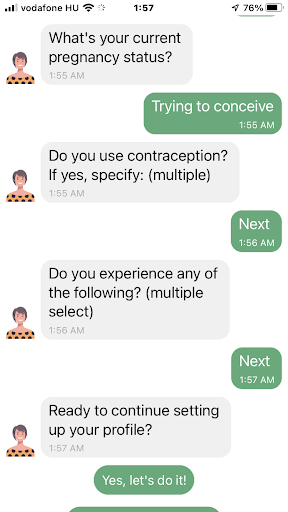
- Visibility of system status: Answers for multiple choice questions only display “Next”. It would be much more user-friendly to show the options I chose.
- Suggestion: Display the chosen options in the chat.
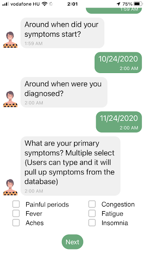

To improve:
- Consistency: The text “Users can type and it will…” doesn’t fit Lasa’s narrative. Probably remained in the app accidentally.
- Suggestion: Rephrase it.
App controls


To improve:
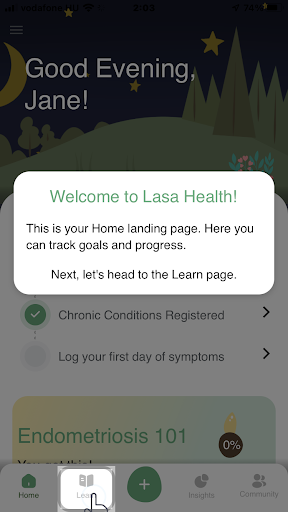
- Consistency: Here the app refers again to endometriosis by displaying Endometriosis 101, even if I did not specify endometriosis among my chronic conditions previously in the chat.
- Suggestion: Harmonize MVP scope and the application’s narrative.
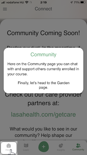
- Consistency: The menu item that is explained in the popup doesn’t match the one that is highlighted in the meantime. This builds a false visual association in the user’s mind, which contradicts the very goal of the onboarding. (See the example screenshot with “Community” on the left)
- Suggestion: Put the explanation and the instruction into two separate popups. When the Explanation popup is displayed, the respective menu item is displayed. In the bottom of the Explanation, create a link (e.g. a “Roger that” button) to the Instruction popup, which only contains the instruction, but below it the next menu item to be clicked is also highlighted. This helps to avoid confusion.

To improve:
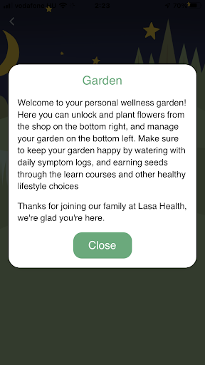
- Visibility of system status: The user sees nothing from what the Garden popup is talking about.
- Suggestion: Create a design that displays the explanation and the object being explained at the same time. This probably needs shrinking or separating the text into several popups to leave enough room for the explained object to show.
Measurement and categorizing issues by impact and cost
In our research, we examine a UX issue in two typical dimensions: its impact on the user’s experience, and by the work needed to fix it. Based on the outcomes, we build a prioritized task list with our clients that deliver the most value for the dedicated budget.
Categorizing problems based on their impact on UX
When analyzing issues based on their impact on UX, we consider their occurrence and persistence – that is, how easy it is to overcome them next time. As a result, we rate them on a 3-degree scale:
Blocking (or critical) issue: prevents the user from using a functionality completely.
Serious issue: user can perform the related action(s), but with much frustration.
Minor issue: Non-critical, but the user will have a significantly better experience with the product if it is fixed.
Categorizing problems based on their estimated fixing cost
When the result of this two-step analysis is in front of us, the next step is to go with a prioritized fixing list (a roadmap of when to fix what), as stated above. The first step will obviously be eliminating those critical issues with a quick and easy solution.
Beyond this, the roadmap is discussed between our client and us, considering time, budget, and usually one more dimension: how well the issue affects the business. (e.g. even if a photo uploading bug is just a minor functionality in the app, if many people mention it in the app store reviews, resulting in low grades, it quickly becomes a severe issue for the business)
When rating issues by the fixing cost, we estimate the complexity of the solution based on our prior experience. We place the issues on a similar scale as above:
Low complexity: it is easy and fast to solve the issue, as the issue is also simple or there is an off-the-shelf, commonly known fix for it.
Medium complexity: the issue can be fixed with redesigning, but doesn’t really affect other parts of the product.
High complexity: Fixing the issue needs rethinking entire function groups, flows or the information and software architecture.
Categorizing issues found in the Lasa Health application
We display our analysis using a 2D scatter plot.
The complexity of fixing the issues was based on our prior knowledge. The real complexity depends on the technology used by the platform, as well as the chosen implementation method (if more than one are available).
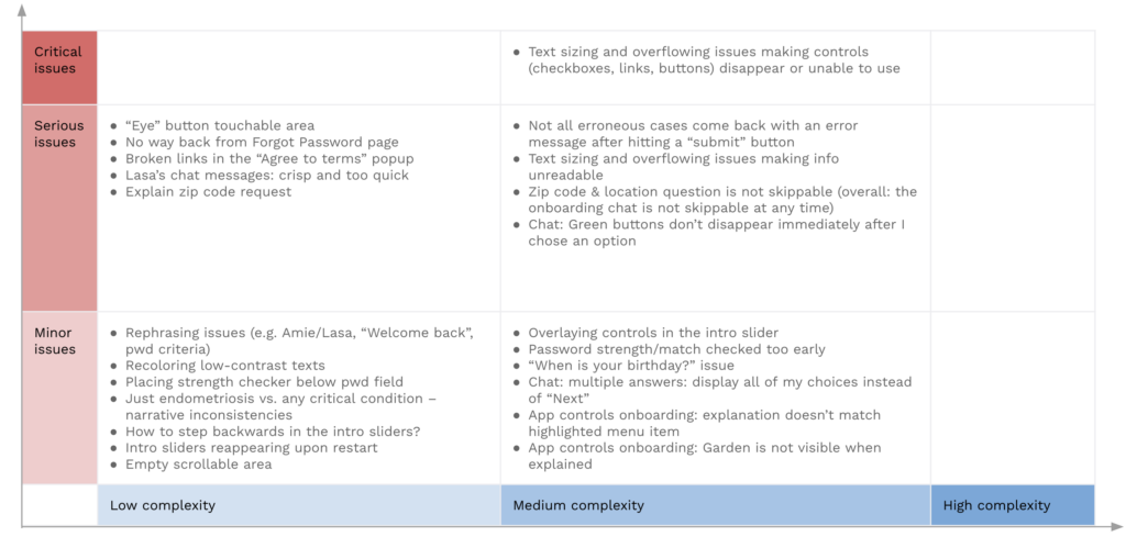

Summary of the analysis
The diagram shows the view is quite nice: there are only one critical issue found in the flow we analyzed. That should be eliminated quickly. There are also some issues categorized as serious, meaning that the user can make their way to their goal, but they will probably experience frustration during the process. In Lasa Health app’s case, this frustration typically will stem from being stuck somewhere or trying to read a message that either flows out of the screen or jumps aside.
We would love to look at YOUR digital product as well!
We help our clients develop their products, starting with a product audit. With the experience of more than 100 projects, we look at the values of a product and key areas to improve within the application, software, UX, design, or user flow.
With our regular design consultation, you’ll get even more to improve your design:
- You receive a thorough audit of your current product, including all flows and several platforms
- You receive a thorough audit of your current product, including all flows and several platforms
- We perform checks on your proposed feature updates to make sure it fits all requirements
- We help you find the best solutions for your actual product design challenges
- You get unlimited access to our experience with 100+ projects
- And if you’re overwhelmed, we can support you with the execution as well